
Intro
In the following I will take you through my process of handling the user experience as well as the interface for an application. I plan on sharing my thoughts while also giving you an honest view of the work. No polishing, no embelishments, but rather the work as it is, sometimes impecably organized, sometimes less so. I will tackle possible mistakes and hurdles I went over, while simultaneously highliting key takeaways.
The project we are going to study is a whitelabel food ordering application for the Irish market. It is intended for restaurants and bars who want their own application, and don't mind having a more generic, yet well built one, while paying a low price. While the direct clients of the app are businesses, the app still needed to be built considering the ordering users as key. The first step in this endeavor was being briefed about the general purpose of the application and what the stakeholders want. Also, I was lucky enough that the product owner had already put pen to paper and layed out a part of the content related taxonomy. It was a great resource to start on. My effort began aftewards and it would be split into four parts:
1. Understanding
2. Defining
3. Designing
4. Testing (and modifying)
Where is the ideation phase? one may ask. Well, it is not actually missing from here, rather it is split and included in the existing stages. In a perfect world, executing "design thinking" by the book, you're supposed to be done with the discovery phase and defining user needs, prior to ideation and brainstorming. And sometimes it goes like this, other times it doesn't. Particularly when working in a dynamic environment, in an agile development process (with crossfunctional teams), some of the steps presented above may intertwine and ideation may sometimes come before the defining step is fully complete, and other times even during the design phase. The fact that a product has reached a certain step doesn't mean people can't come up with ideas. Whether they get implemented or not is another discussion, though.
So, let's get into it, starting at phase one:
So, let's get into it, starting at phase one:
1. Understanding (Preliminary research)
Looking at the history of this business model and overcoming bias
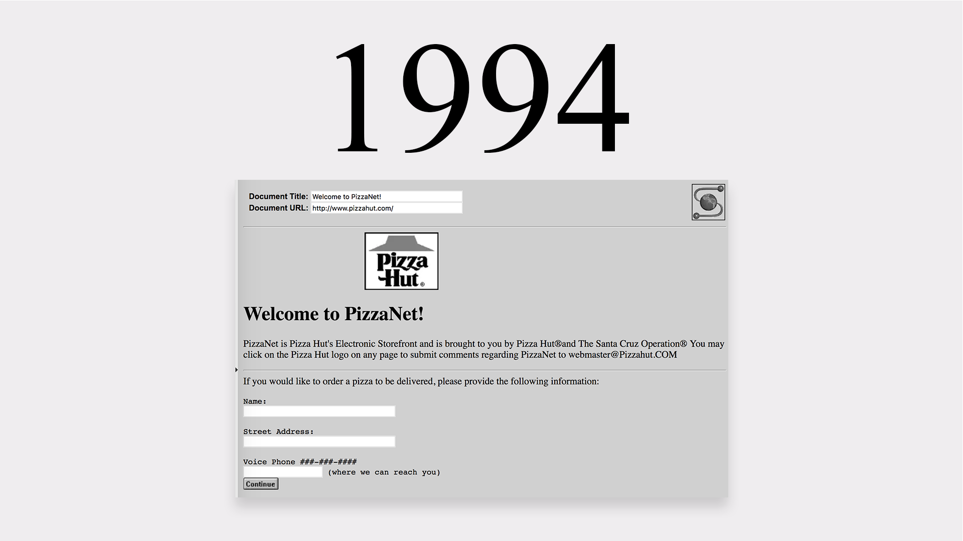
Online ordering services have been around for many years now. Waiter.com (initially World Wide Waiter) has been around since 1995. And even before that there was PizzaNet, which was PizzaHut's digital ordering hub, with the first pizza order registered in "94. This was 10 years before I started my design career, and the same year Nirvana released "MTV Unplugged in NY", to put things into perspective. And perhaps also a bit relevant, back in 1989, Peapod launched the concept of online grocery deliveries. (Source: https://www.verdictfoodservice.com/comment/online-food-delivery-timeline/ )
Why is this worth considering? It's important to help people overcome a possible age bias regarding users. So, while the idea that older people are reluctant to use new technology does have some merit to it, what history comes to show us is that ordering food online is not considered new tech in 2022. This just comes to underline how important inclusiveness is when considering your user pool.
There were other pluses related to this as well, especially concerning research. First of all, I already knew these services work well and people enjoy them (considering the number of players on the market and their revenue), so I didn't necessarily need to make polls to find out if users would be interested. Empirical knowledge saved development time.
(Source: https://www.businessofapps.com/data/food-delivery-app-market/ )
But since competition is a thing, I needed to find an edge. Interface auditing and gauging possible user pain points (through personas) were just the beginning of it. Of course, working with stakeholders which had large experience within digital environments as well as within the hospitality business helped a tremendous amount. No application is a one man effort.
Demographics
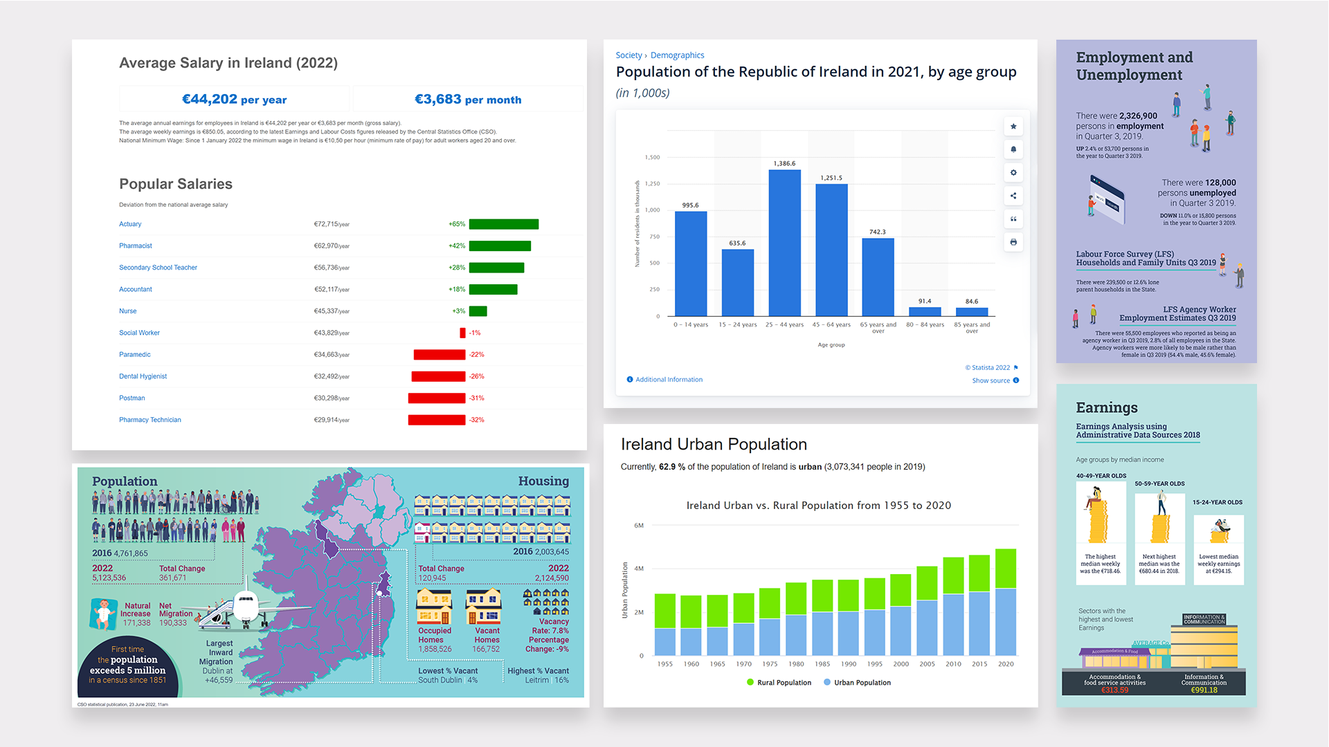
One of the first things I did in the discovery phase was to look at demographics. I needed to understand who are the people who order through applications, how often they might do it and why. This is what is called secondary research, which basically means gathering and interpreting data that is already available. (Main source: https://www.cso.ie/en/)
Ordering takeout is definitely more expensive than cooking at home, so I needed to understand who are the people earning enough to order through an app. And more importantly, who are the people which are ordering FREQUENTLY. Here are just a few cut-outs of the research.
Ordering takeout is definitely more expensive than cooking at home, so I needed to understand who are the people earning enough to order through an app. And more importantly, who are the people which are ordering FREQUENTLY. Here are just a few cut-outs of the research.
Interface auditing
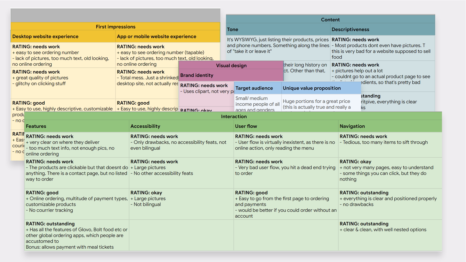
Another important part of the preliminary research was interface auditing which is basically a fancy way of saying that you look at what the competition is doing, rate and compare their interfaces. This is crucial in understanding what is important for most users - for example, if you look at five applications and four of them have feature A, then you must seriously consider having feature A as well, even in the most basic form, if not an improved one.
This method also has great merit in understanding possible weaknesses that the competition may have. For instance, smaller businesses didn't take accessibility too seriously. Which leads us to the next point: The market here was split into two sectors - small business and large business. As one would expect, when large global corporations have a foothold in any local market, they dominate the smaller businesses. In the interfaces I studied I noticed this dominance also being done by simply having a better product in terms of UX. Of course, it goes without saying that a smaller restaurant doesn't have the same investment power as a delivery giant such as Deliveroo, or JustEat. This is why a white-label solution made with great design and user centricity in mind would really find its place in this market.
This method also has great merit in understanding possible weaknesses that the competition may have. For instance, smaller businesses didn't take accessibility too seriously. Which leads us to the next point: The market here was split into two sectors - small business and large business. As one would expect, when large global corporations have a foothold in any local market, they dominate the smaller businesses. In the interfaces I studied I noticed this dominance also being done by simply having a better product in terms of UX. Of course, it goes without saying that a smaller restaurant doesn't have the same investment power as a delivery giant such as Deliveroo, or JustEat. This is why a white-label solution made with great design and user centricity in mind would really find its place in this market.
I tracked things like: features, accessibility, user flows, general navigation, USPs, visual design, impressions on user experience in both desktop and mobile services, but also tone, descriptiveness and more. Here are a few cutouts of the research done here:
2. Defining
Going into the "Define" stage, with user personas
To me, user personas are the bridge between the discovery phase (understanding) and the defining part. After gathering readily available data from the Internet, I wanted to figure out how an application such as this might fit into people's lives (aka when, why, how would they use it). This is also where guerilla comes in handy, especially if time pressed.
Generally, even five to ten interviews with coworkers or friends who fit the target audience can go a long way (obviously, more are better). The main (but not singular) criteria was that the interviewed individuals already use a food ordering app. Since there is no lack of those, it was quite an easy criteria to fulfill.
The key here is to know what and how to ask. I needed to use open ended questions, be impartial, let them give as many details as they want without leading them to any answers. But first and foremost was to explain that there are no right or wrong answers, and to set a relaxed tone, so they would be comfortable sharing their experiences.
Some very helpful interview questions were:
How long have you been using food ordering apps for? How often do you order food online?
How long have you been using food ordering apps for? How often do you order food online?
When would you say you use them most frequently? Is there anything that influences this?
What is your main reason for ordering food online? How do you feel a food ordering app integrates with your life?
What are some features that you really enjoy in the app you most frequently use? What about feats you dislike or consider are missing?
These types of interviews help you envision a day in a user's life and how the service you provide makes that day easier or more pleasant.
These types of interviews help you envision a day in a user's life and how the service you provide makes that day easier or more pleasant.
Without further ado, here are some user personas I managed to construct after this phase of research:
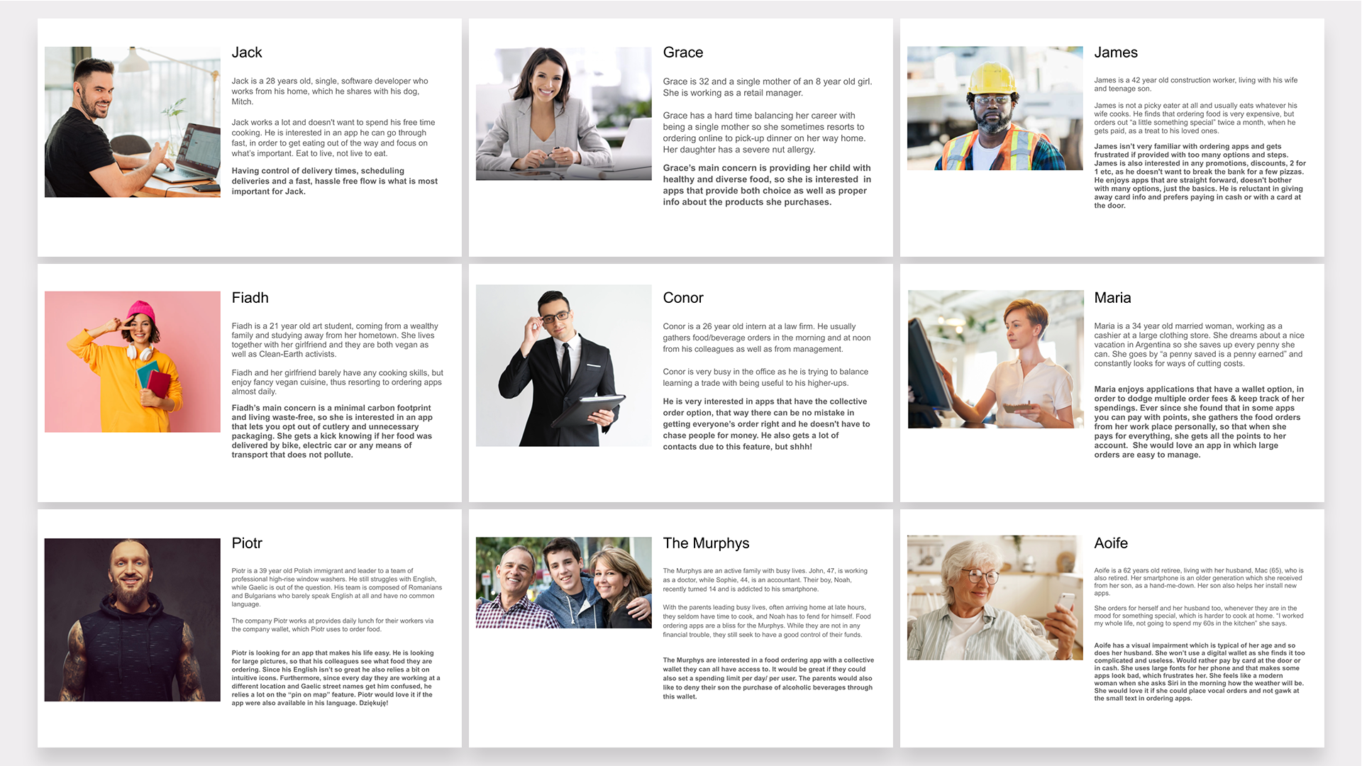
This helped us define not only user needs but strategize about the development process. For instance we came to that a worthy MVP would be one that catered to the needs of the largest user groups, while following updates would also solve the needs of the smaller user groups. All this while also defining who the predominant group is. We then realized FOR WHOM the features that we have already discussed would be useful, and how to rank these in terms of importance and user-impact.
To balance the scale, one of my favorite feats that came out of this was adding the possibility for a user to opt-out of cutlery and/or unnecessary packaging. Very nice feature for a small group of people who are concerned with a minimal carbon footprint, but this may catch on to others, while also being easy to implement and potentially saving restaurants a pretty penny in single use cutlery and packaging. Nice!
To balance the scale, one of my favorite feats that came out of this was adding the possibility for a user to opt-out of cutlery and/or unnecessary packaging. Very nice feature for a small group of people who are concerned with a minimal carbon footprint, but this may catch on to others, while also being easy to implement and potentially saving restaurants a pretty penny in single use cutlery and packaging. Nice!
The main idea from the start of this project was that small and medium business owners needed a solution to help them stay competitive on the food delivery market, by paying lower fees than they would to the well known apps. Having this cost efficient app is the very solution for their problem. So, now, when talking about defining user needs we are talking about defining the needs of the people who are ordering the food. And that's exactly where the personas lead us to. The features of the app are coming straight out of their needs. These would be the base we build upon.
The user journey
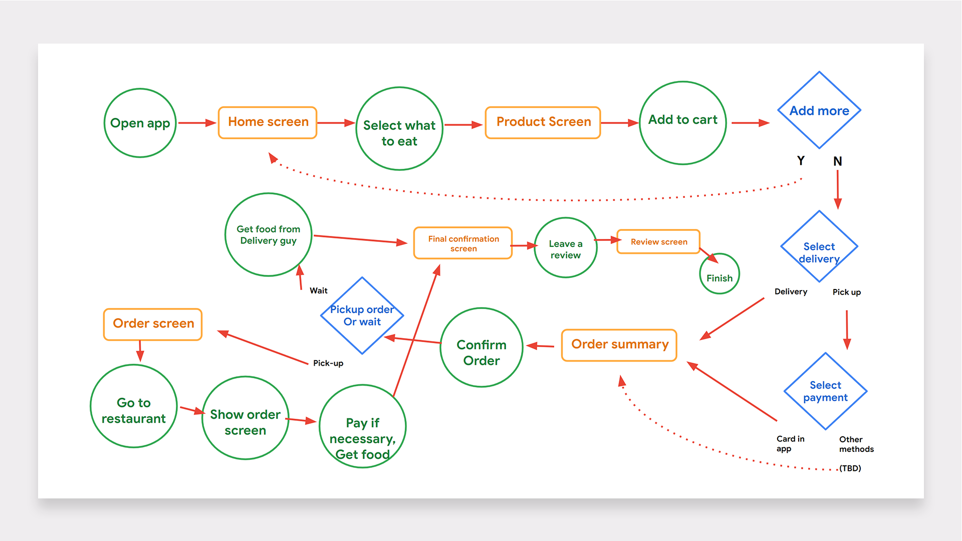
Another key takeaway in this stage was the user journey. This was based on getting together with stakeholders and having a brainstorming session, while also having previous research in mind. This is why, in the intro, I stated that coming up with ideas isn't necessarily limited to a single stage of the product development. Design thinking may be a little more fluid in real life than it looks on paper. Of course there was a bit of back and forth here and some people already came up with ideas for features even while talking about the user journey. Creativity and feedback are always welcomed.
What we were looking for, prior to going into the design phase was to gather ideas for solving user problems, in a judgement-free environment. So what came out of this was this initial user journey. This had been improved upon several times until the end of the process, below I am showing the starting point. I think that the beauty of the "web development" concept is the very word "development", which means everything evolves.
Often times in the process when I would add a new step to the journey, if I was already in the design phase, I wouldn't come back to update this graph. Is this a mistake? In my case, since I was the only designer on this - not the best practice, but didn't influence the process. But imagine if multiple designers had to work on this, how jarring they would find it if they would see this user journey and then different mock-ups, with extra actions. The world wouldn't explode for sure, but it would generate some extra Zoom calls, at the very least! This is why self-reflection is important in professional evolution. Realizing your own shortcomings is the first step towards evolution. Without further ado, here is the first logical scheme:
3. Design
So, finally reached the design step. The step that gives our job its name. Let me kickoff with a few questions: Can you start building a design system prior to defining the user needs? Probably yes - every app is going to have inputs and buttons, no? Can you start building a logo before you get to the interface? Of course you can. For this specific application though, I already had a design system in place which I had previously developed for this client. And since it's a white label application, I didn't need to bother too much with a logo, rather just a placeholder.
So, I started with some very basic sketches that were relating to the most important features, as that was the best thing to do, in terms of time management. When thinking about an ideal design plan, you don't want to waste time creating something super-polished when you are only trying to illustrate basic concepts. If you read about it in articles, or courses etc., any design should first go through a lo-fi mock-up stage, in which you just put the logic from the above graphic, into something that starts to feel like a product intended for humans. (more on this type of thinking over at the NN Group: https://www.nngroup.com/articles/design-thinking/ )
However, things aren't always so linear, in real life and often times you have to step out of the lo-fi mock-up area and go into something hi-fi, so that someone involved may achieve a better understanding of things. And this is something that designers and journalists have in common, which is that you always have to address people in a way that is understandable FOR THEM. So if a stakeholder doesn't understand an abstract element (you will see plenty below), as a designer, it is your job to handle the situation, sometimes by giving life to the abstract, in a hi-fi mock-up. This little trick will end up saving a lot of development hours, further on. Imagine something is left unclear after the sketching phase, goes into hi-fi etc. only to get knocked out later, solely because a stakeholder misunderstood your sketches. An extra bit of effort here can go a long way.
Prototyping: Sketches and storyboards
Here are the very first drafts. On the left you can see some lo-fi mock-ups of the app (just a part of them, the whole app is a lot bigger than that). And on the right you can see some beautiful art which I am sure will be worth millions in a few years. This "art" is also called a storyboard and it was done roughly about the same time as the user journey, the wireframe prototypes on the left being built with this story in mind. I thought it would be better to show these two together, so it is easy to observe how one sketch influences the other.
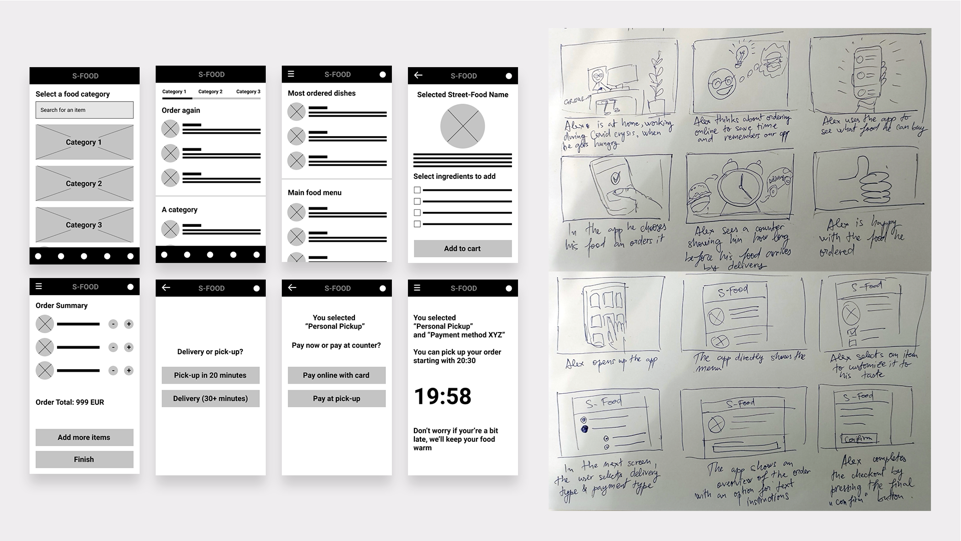
There were initially three options for the homepage (as seen in the sketches) and you will notice in the following hi-fi mock-ups that the winning option didn't go through 100%, but rather suffered some modifications. And this gets us back to ideation and working in an agile way. Sketches get approved, hi-fi starts and then maybe either myself or someone else comes with a better idea to do things. What is there to be done? Of course we're going to improve things if the idea is really good, even if we have previously committed to a bunch of prototypes. And when talking about ideas coming to mind, well, they sometimes come only after you put enough work into a project. And that leads me to the following:
Edge casing for people with special needs generates changes in design that benefit everyone
Some of the best ideas come from solving edge cases. For example, I initially thought about one user persona who had food allergies and I wanted to mark down allergens in the menu, for said person. Easy. So that would have been it, in the initial prototypes, but I wanted to take it one step further. So, the idea came to give the user the option to communicate with the kitchens. For example, let's say someone is only allergic to the chocolate topping of a desert - we give them the option to write "please no chocolate topping". Simply showing that the item has chocolate is not enough, since by witholding an ingredient, it is no longer a problem-item. This type of input field also came with great a great bonus for people who don't even have allergies. Let's say for people who want their food or spices handled in a special way, such as "please make it extra spicy" or "please not so much sauce" etc. So, by solving for people with special needs we actually brought a great feature for everybody else.
Now vs The future, thinking & designing for today and for tomorrow
I feel like designing for now is an easy feat. Even designing for the close future. I just do my research, ask people about their needs, what frustrates them and so on. Afterwards I interpret the data, or maybe extrapolate from given info. And I create an application that is good now, this year and maybe the next. The true challenge is designing for the future, as the people at Google put it - "design for the next billion users". (Source: https://design.google/library/ux-next-billion-users/ )
And this challenge comes in two ways:
The first way, which is the easiest of the two - creating a modular product that can easily withstand multiple improvements. And what we went to do here is build a great backbone for this service, foreseeing possible additions in the near future. One way to do it is via multiple levels of navigation, as most improvements will be per existing pages, not only new items. It may sound abstract right now, but let me give you an (unrelated) example as I don't want to spill the beans on this one. Let's say you build an application for people with cars, who need a mechanic. The app launches with a simple, transitive welcome screen, prior to showing the mechanics list. Later on you can integrate multiple options in the welcome screen, not only looking for a mechanic, but also the purchase of car parts, finding a car wash or other car related services and so on. Once you get a large enough user pool you may sell advertising space to relevant parties. Now this is just building on the same base. But the other provocation is so much more.
The second challenge is part imagining and being creative and a great part being well informed. So it's like an educated guess from a creative person, haha! The "informed" part is easy - you just need to look at the way the digital world is evolving and what new services users are adopting. For example, when smartwatches popped up a few years ago, making an app fit with them was the smart thing to do, even if they weren't so widespread at first. Another thing is to be able to imagine whether or not digital services will become more connected to each other (they will!) and how that may fit with user needs. So, thinking out of the box for the earlier car related example would be something like - having an app that connects to your car via Bluetooth, as the base. Then imagine this: you are in the car and the app pulls data from the car and knows you should be soon getting your periodical technical check up. So, the app matches the schedule of nearby mechanics with your schedule, based on your calendar, then makes recommendations. Thinking this way is thinking for the future.
If the time, the budget and the people you are working with all allow it - thinking about the future and the future of the app is well worthwhile.
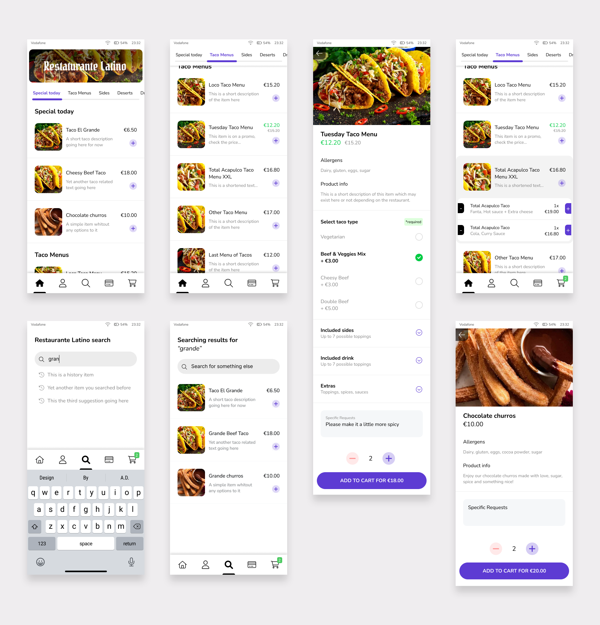
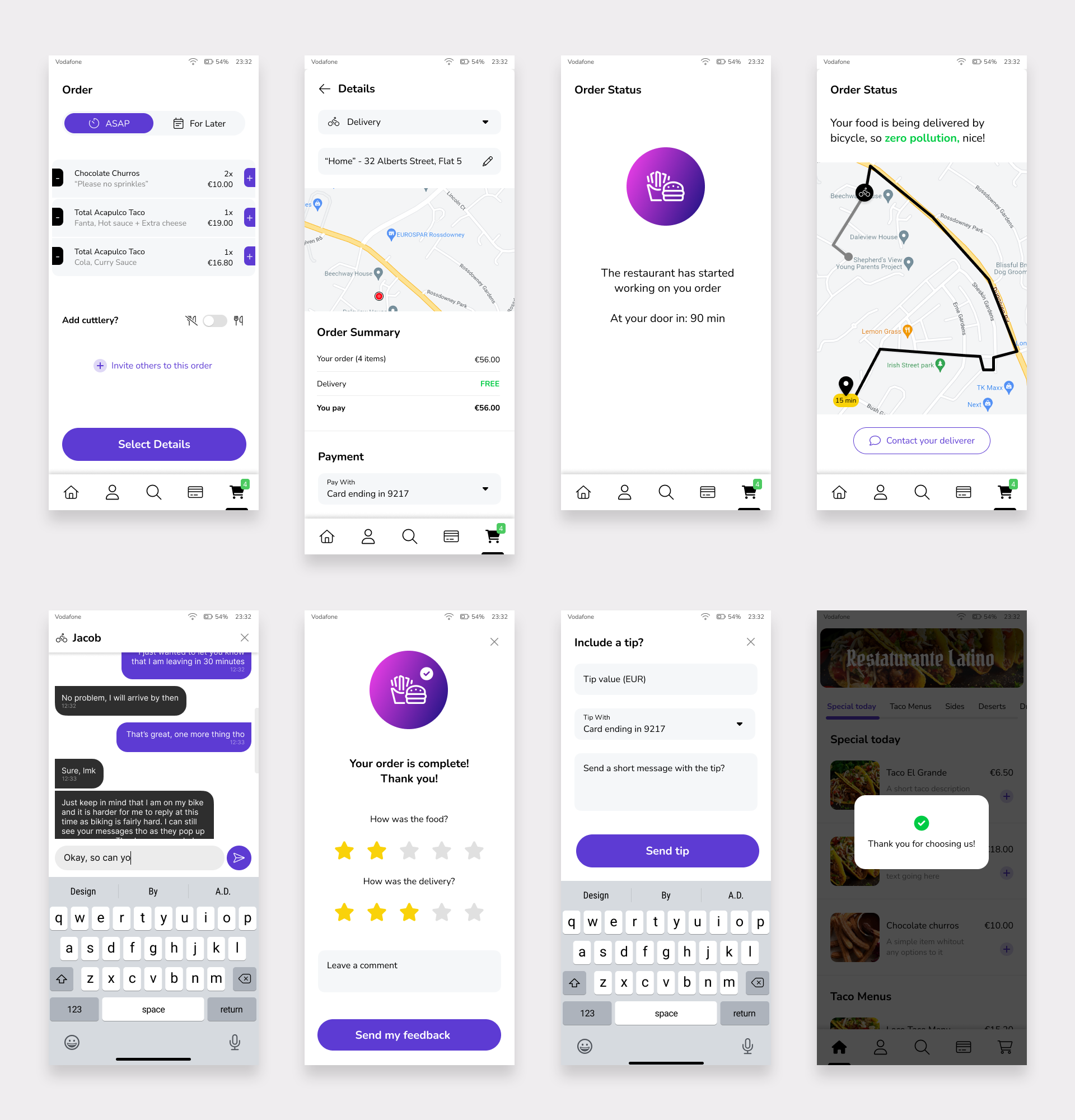
Keeping these things in mind, let me show you some of the hi-fi images of this project, that were built for the now, for getting the MVP rolling, while the best parts I hope to show in my folio at a later time.
I feel like designing for now is an easy feat. Even designing for the close future. I just do my research, ask people about their needs, what frustrates them and so on. Afterwards I interpret the data, or maybe extrapolate from given info. And I create an application that is good now, this year and maybe the next. The true challenge is designing for the future, as the people at Google put it - "design for the next billion users". (Source: https://design.google/library/ux-next-billion-users/ )
And this challenge comes in two ways:
The first way, which is the easiest of the two - creating a modular product that can easily withstand multiple improvements. And what we went to do here is build a great backbone for this service, foreseeing possible additions in the near future. One way to do it is via multiple levels of navigation, as most improvements will be per existing pages, not only new items. It may sound abstract right now, but let me give you an (unrelated) example as I don't want to spill the beans on this one. Let's say you build an application for people with cars, who need a mechanic. The app launches with a simple, transitive welcome screen, prior to showing the mechanics list. Later on you can integrate multiple options in the welcome screen, not only looking for a mechanic, but also the purchase of car parts, finding a car wash or other car related services and so on. Once you get a large enough user pool you may sell advertising space to relevant parties. Now this is just building on the same base. But the other provocation is so much more.
The second challenge is part imagining and being creative and a great part being well informed. So it's like an educated guess from a creative person, haha! The "informed" part is easy - you just need to look at the way the digital world is evolving and what new services users are adopting. For example, when smartwatches popped up a few years ago, making an app fit with them was the smart thing to do, even if they weren't so widespread at first. Another thing is to be able to imagine whether or not digital services will become more connected to each other (they will!) and how that may fit with user needs. So, thinking out of the box for the earlier car related example would be something like - having an app that connects to your car via Bluetooth, as the base. Then imagine this: you are in the car and the app pulls data from the car and knows you should be soon getting your periodical technical check up. So, the app matches the schedule of nearby mechanics with your schedule, based on your calendar, then makes recommendations. Thinking this way is thinking for the future.
If the time, the budget and the people you are working with all allow it - thinking about the future and the future of the app is well worthwhile.
Keeping these things in mind, let me show you some of the hi-fi images of this project, that were built for the now, for getting the MVP rolling, while the best parts I hope to show in my folio at a later time.
4. Testing
I honestly don't remember who said this first, but I agree that "an easy to use interface makes users feel smart". This is why testing designs PRIOR to launch has tremendous importance. It may also be the most frustrating step, as this activity will put a mirror in front of your designs and show you their flaws.
As a designer, I think a lot about the problem I am trying to solve, do my research, talk to (potential) users, talk to stakeholders, use my experience to build the best I can. But even then, I still have to ask myself - does this interface make sense to everyone? Is it easy to use? Are there features that people may find confusing? After working for a long time on any project it's easy to become biased and since, as a designer, you know the interface like the back of your hand, you may think something is intuitive or easy to use. And sometimes, this assumption may prove to be wrong.
"Hey, man, got a minute?"
The first batch of testing I like to do is guerilla testing with other developers. And someone may say "but developers are tech savvy, unlike the common user" and that is... exactly the point. Showing my interface (even as simple source, not necessarily a prototype) to a dev is the first gauntlet it has to go through and possibly the hardest one. The merit of this method is easy to comprehend: If a dev (aka someone who, through the nature of their job, looks at interfaces all day) finds a part of your interface to be jarring or confusing, then imagine what it would be like for the common user. If you build a car that a race pilot can't figure how to drive properly, then for a less skilled driver, it would be a nightmare. To my relief, this method caught a few small mistakes here and there, mostly regarding redundant controls in the initial interface built. However, keep in mind this method isn't supposed to replace "real world" user testing. The fact that a dev may find a feature easy to use, doesn't mean a regular user will too, but this will catch the bigger flaws earlier on. More on this in the paragraphs dedicated to usability testing.
Questioning a test's validity, accessible design & examples
In the image below you will see the evolution of the interface in regards to controlling the number of similar products in the cart. There is quite the difference between "the interface has the option to do X, Y, Z" and "the interface options to do X, Y, Z are easy to understand and use". What we are looking at is the items in the list that are also in the cart and the way this is signaled to the user.
It started at version A which got a polish and version B came up. Version B is perfectly viable from a UX standpoint (and, to be frank, my favorite of the bunch), but the stakeholders weren't happy with the way it looks. One person involved came up with the idea that instead of using pluses and minuses, we'd use red/green side-lines and that users would understand what those meant. I instantly opposed this, stating this is a very uncommon way to control quantity, adding that the sizing is too small.
"Typically, a fresh design will be a worse design simply because it's new and thus breaks user expectations. A better strategy is to play up familiarity and build on users' existing knowledge of how a system works." (Source: https://www.nngroup.com/articles/fresh-vs-familiar-aggressive-redesign/ )
The person who came with the idea did a quick test and the respondents all claimed that those lines were related to increasing/decreasing the number of items. I had no control over this test and also thought that he used a too small batch of participants (only four), whose answers he could influence (as they were close to him). Thus, the validity of this test was questionable. I couldn't let this slide.
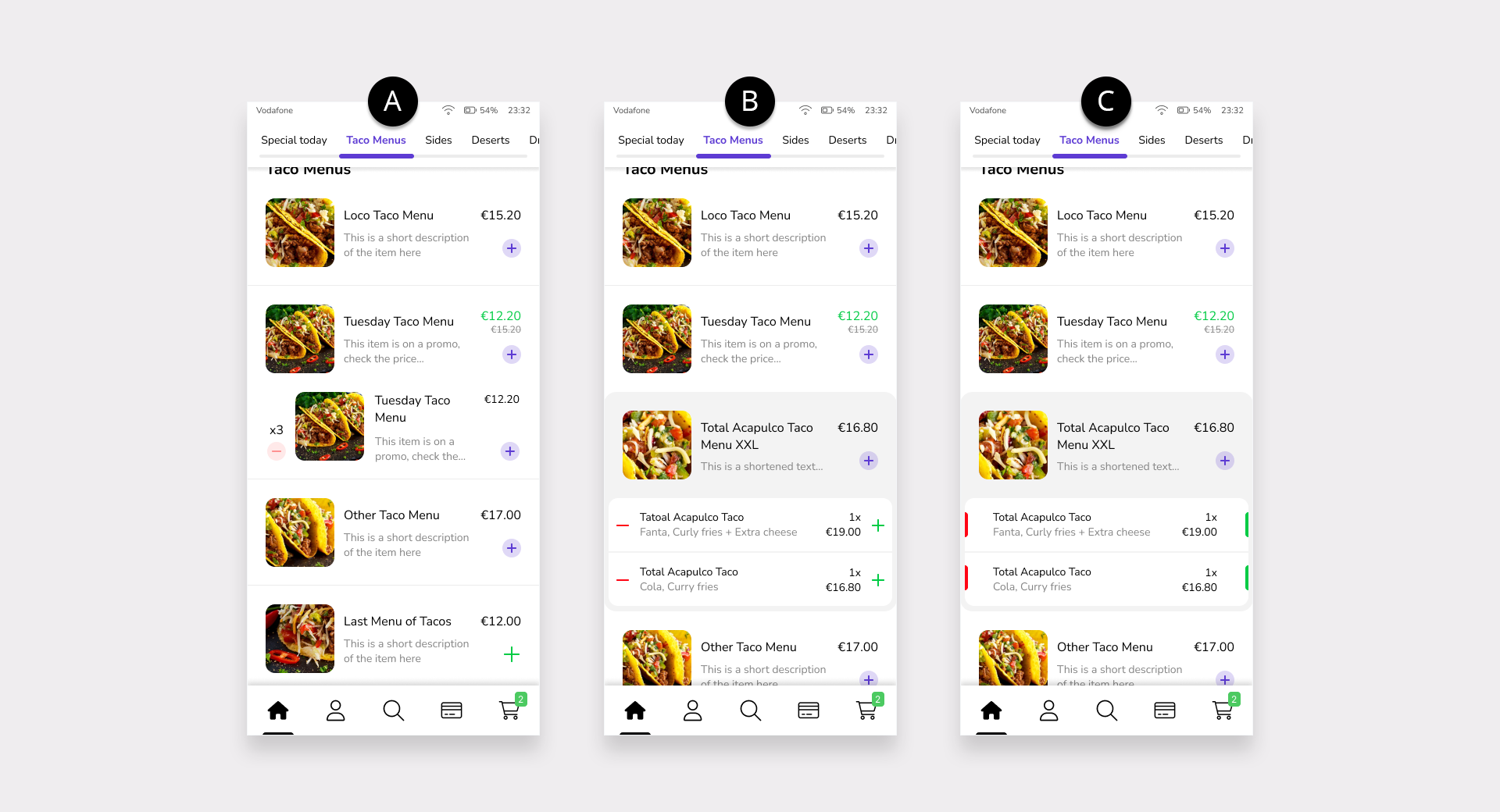
But then another reason why this UI wasn't good enough came to me. It simply does not cater to people who are color blind or those who may suffer from temporary disabilities. A temporary disability (related to this case) may be poor vision or being inattentive, based on temporary circumstances (i.e. being exhausted, being in an agitated or crowded place, a poorly lit environment etc.). So, aside from color blind people, who will make nothing of those lines in version C, a healthy person, on a crowded bus, going home at dusk may also have a hard time using those controls. We can't assume everyone is using the app from their homes in perfect conditions. (source and longer read on accessible design: https://accessibility.digital.gov/ux/inclusive-design/ )
And this was what I used to defend my views and convince the people involved that (just) colors weren't enough and we also needed symbols. The fact that to have a proper "signal" you need both (and sometimes more) is nothing new and anyone with a driver's license knows this already. However, if you are only to use one of the bunch, it is preferable to use the shape rather than the color. In the back of my head I knew this from the get go, my only shortcoming here is that I didn't think of it faster. There are popular apps like Instagram or Uber, worth looking at, who enforce this theory.
Short discussion on skeuomorphism, the "new familiarity" and senior designer bias
Short discussion on skeuomorphism, the "new familiarity" and senior designer bias
At the time I had designed this application I had already been designing sites and apps for more than 18 years. I am also an avid user of digital products in my private life, thus, I am constantly updated on the latest trends in interface design. However, I do have experience using "old school" interfaces as well, both digital, as well as real world ones. So, what I needed to do here was to overcome my bias related to older models and know where to modernize.
Skeuomorphism makes us design digital controls that sometimes look like their physical counter-part. And this was great for many years. But since digital interfaces have been a part of human life for a few decades, the need for skeuomorphism has decreased. As such, you will notice a lot of apps are no longer displaying some controls in traditional colors and a lot of effects have been ditched along the way. One may notice through empirical observation that while "delete" is still mostly displayed in red, sometimes, plus and minus are displayed in neutral colors, while interfaces in general tend to go to more neutral colors which are helpful when you navigate for extended periods of time. Additionally we may take note of the evolution of the interfaces of Apple products. This company who had been a champion of skeuomorphism back when they launched their first iPhone in 2007, moved away from it, six years later, with iOS7.
(sources: https://www.interaction-design.org/literature/topics/skeuomorphism and https://www.theguardian.com/technology/shortcuts/2013/jun/12/skeuomorphism-apple-ditched-ios7 )
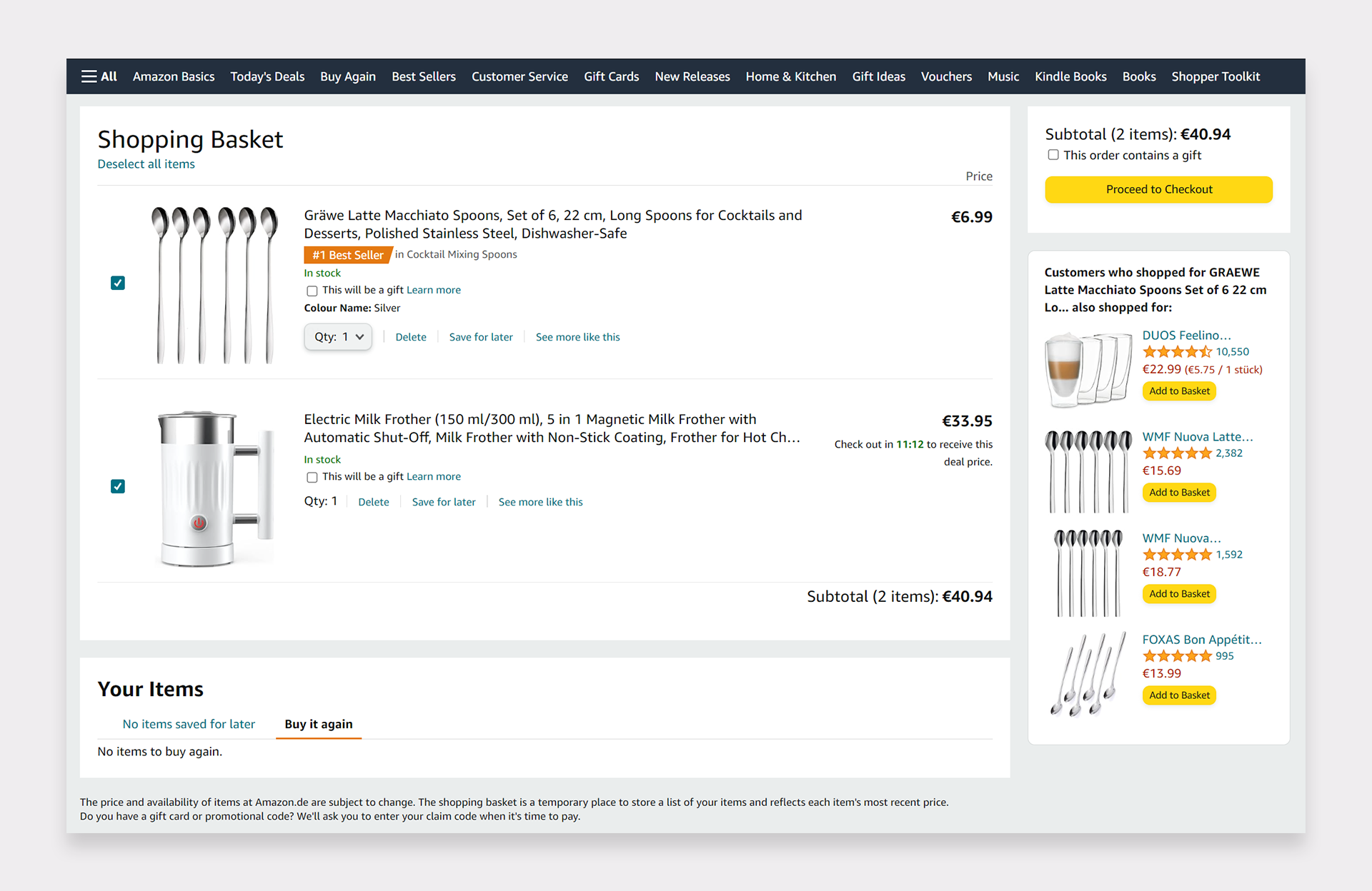
I would like to present for analysis a print-screen of the cart experience at retail giant Amazon. Let's take a look at the colors and how color highlights importance. Prices of the items already in the cart are black. Prices of items that can be added are red. Purchase related call to actions are in warm, bright colors, well highlighted, while secondary controls are in cold blue or neutral coloring. Now look at the quantity selection - it feels rather unimportant, compared to the rest of the items present on page. Perhaps in an older interface, in 2010, let's say, that drop-down-select would have received a highlight as well, but with users getting more familiar to digital UIs, it is no longer necessary. This is important to understand so that we see the reasoning behind what will be presented next.
Drawing conclusion from the above
Drawing conclusion from the above
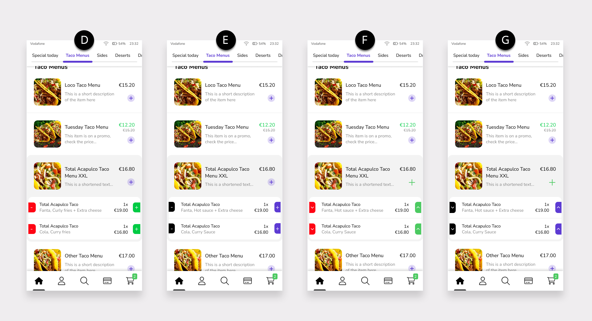
We continued development of the screens above, with option D, that got declined into E and then F. Pluses and minuses (as symbols) were shown again and rejected, so I had to use upwards and downwards arrows for this. Option F was OK from a usability standpoint, but while iterating further we reached the conclusion that when several products are selected, this becomes too visually dominant for the (low) importance that it has. Version G was the most aesthetically pleasing of the last ones shown. So, we have something that the stakeholders like, which isn't so much "in your face", has symbols which people can easily comprehend and is not based on color alone, so it's done! For what it's worth, I think options B and E were the better ones, but at least I managed to steer us away from option C, and that is a design victory in itself.
You may have read so far and think to yourself - "so much effort for just two buttons" and I will tell you that in real time this friction lasted for a few hours of an afternoon, but landed us a better product.
The importance of the history of testing in minimizing development time
Knowing a bit of testing history saves time. A famous test by the Hitachi Corporation teaches us that users find interfaces which are aesthetically pleasing to be easier to use. To describe the experiment briefly, a large group of users had to use the interfaces of two identical ATM machines. Both machines had interfaces with the same functions, however, machine A displayed an eye-pleasing design, while machine B displayed an "ugly" design. When asked which was easier to use, they gravitated towards machine A. This is called "the aesthetic usability effect" and shouldn't be disregarded. (Source: https://bootcamp.uxdesign.cc/the-aesthetic-usability-effect-6450f645d1d3 )
However, in doing this, I did have to put a pin in it, to watch over in future testing.
Towards the finish line: Cognitive walkthroughs as usability testing, in two steps
There are multiple research methods that one can employ, to ensure the best product is sent out the gates. Of course, each of these has its merit in the proper moment and circumstance. There is a large discussion about what to use and when, but I think all digital products should go ahead and do usability testing, prior to launch. (disambiguation: https://www.nngroup.com/articles/which-ux-research-methods/ )
I split this usability testing into two: the one I do myself and the one I do with others.
Step 1: making sure everything connects
As I have previously stated, in the web development process, changes to the initial sketches may occur. So, it is necessary to create a functioning prototype after the hi-fi design is done as well, just to check if navigation is smooth. Each and every flow needs to function back and forth and have no dead ends. The easiest way to check for this is to create the hi-fi prototype and go through your work the same way a user would. Press everything, go everywhere, try all aspects. This is a great thing to do, also in terms of software feedback. Sometimes, when designing, I notice I may forget some dialogue boxes, but when doing the usability testing myself, I always fill them in.
Step 2: showing it to potential users and seeing how they use it
The good people at the Boulder University of Colorado have been writing about cognitive walkthroughs as forms of usability testing long before I started doing design. (source: https://www.colorado.edu/ics/sites/default/files/attached-files/93-07.pdf ) What their method implies is to don the proverbial lab coat and watch others use your creation, as a researcher watching a mouse inside a maze. Well, hopefully, less complicated. So, users get the app on a smartphone and are required to perform several tasks within it (all receive the same tasks). In this particular case, an example of a few simple requests would be:
a. Add item X to your cart
b. Add two portions of item Y to your cart and make sure they contain no pickles
c. Have items X and Y delivered to your office at noon
As users would perform these tasks, I would note down how well the app is doing and potential hurdles a specific individual would encounter (if any). The best way to do this is in the same room as said user, due to possible distractions. For example, if you do this remotely and simply record the user's screen, you may encounter false positives. Outside of a UX lab, a user might stop testing your product to talk to someone close by and the screen may record that the user spent an enormous amount of time performing a certain task.
Ideally, there are no issues and everything is easy to understand. Yet we still want to gauge the following:
1. Did the user try to achieve the right effect? If yes, was it in a reasonable amount of time? (see false positives above)
2. Did the user notice that the correct action is available?
3. Did the user associate the correct action(s) with the effect they are trying to achieve?
4. If the correct action(s) are performed, did the user see that progress is being made toward the solution of their task?
There are several remarks regarding these questions (and their answers). In the testing of my apps in recent years, I've usually had little to no problems with questions 1 and 2. Which is a great thing in itself, especially regarding the second one. The more complex the product, the harder it is for a user to locate a function. Since our app is fairly simple (and also follows a beaten track) this is why features like the earlier discussed item quantity are easy to manage. An example of a complex app having a hard time with this comes from Google. Imagine that in a publicly available testing of Gmail labels, a lot users got frustrated because they couldn't find the function on their screen, due to the clutter of data. (Source: https://www.coursera.org/professional-certificates/google-ux-design )
However, a surprising thing happened regarding question 3, prior to testing with real users. The "Order" page I initially designed, which has a "tab" like behavior from a navigational point of view, also had an "x" on top right. This X would just close the page, returning the user to the homepage. It was a redundant control, since users could also press the home button for the same effect. One of the developers involved thought that pressing that X would remove all the items in the cart. Of course, this was not the intended function and since the control was redundant, I decided to remove it altogether, that way users wouldn't get confused in a similar fashion. Regarding the last question - this is why I earlier stated how important it is that I, as a designer, do a usability test of my own. Creating all the dialogues for the right moments is paramount and will reduce any possible user confusion.
With these being said, I am happy to say the app did good in the tests. Long process yielded great satisfaction in the end.
Final Thoughts
I was a great feeling when this got all the green lights. I have learned from this experience and the knowledge acquired here will help me build better stuff. However, is my work here done? Of course not. There is still a lot to work on post-launch, like adding new features and maybe improving existing ones, based on users needs. All with lean launches in mind, and A/B testing as well.
As for user feedback - if I learned anything from previous experiences is that having a tight relationship with the support department is basically free data collection regarding user experience. Such a great resource! Aside from that, gathering user metrics is a simple quantitative way to look at performance: session durations, heatmaps, conversion funnels etc. are all worthwhile looking at. But that is a story, pardon, case study for another time!
Thank you for reading!