I had a contract with a client for a few SaaS projects and the first thing I did was put in place a design system, so that we would have a consistent graphical communication across all solutions and environments. You may see an example of how I implemented it, in this piece of work.
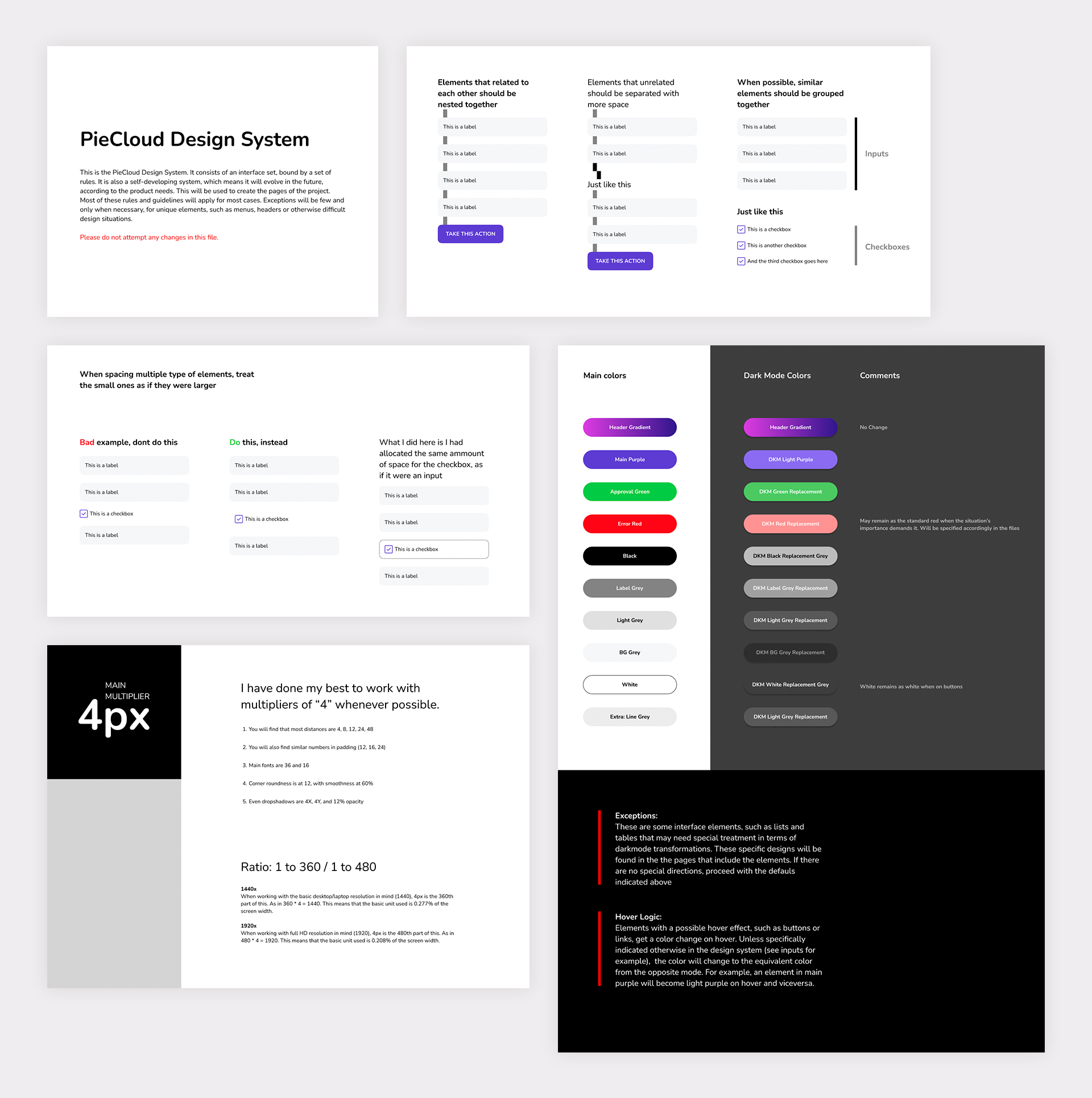
Laying down general rules & colors
Working with a smart color scheme is essential - all the colors used in the system have their own equivalent in dark mode, the transition is very smooth, with easy to insert replacements.
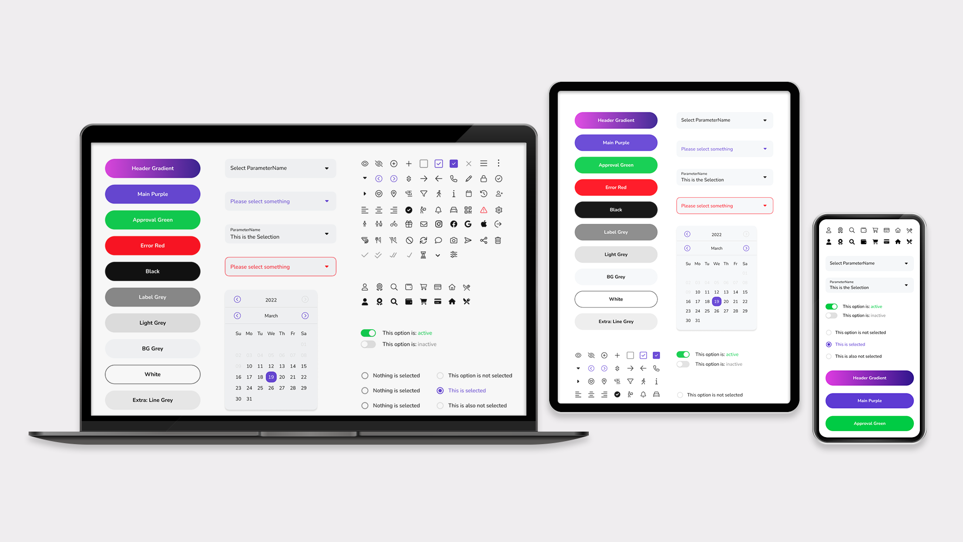
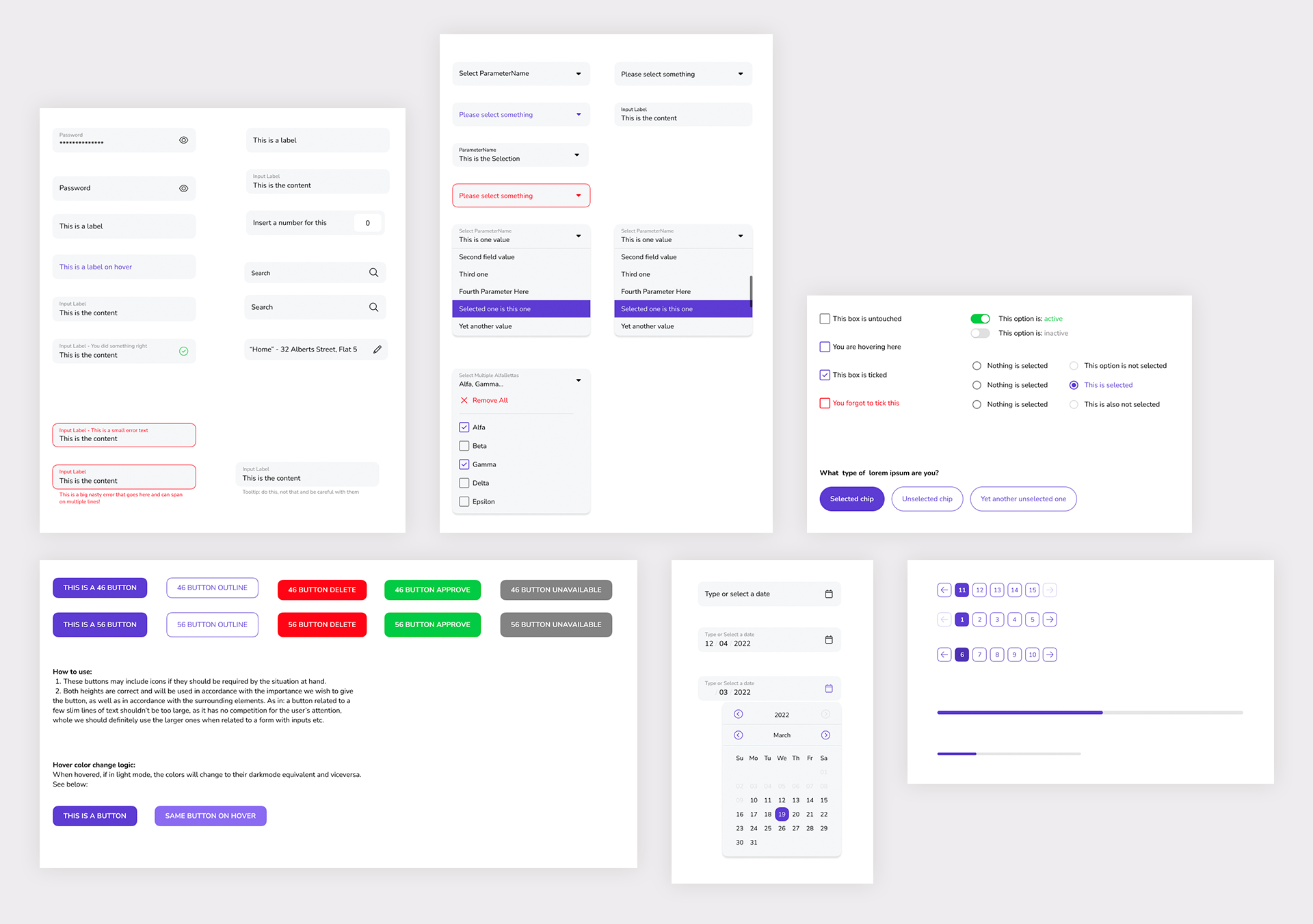
Creating the graphic user interface
This is the core of the system, the actual interface elements, influenced by Google's Material Design, while respecting industry standards and trends.
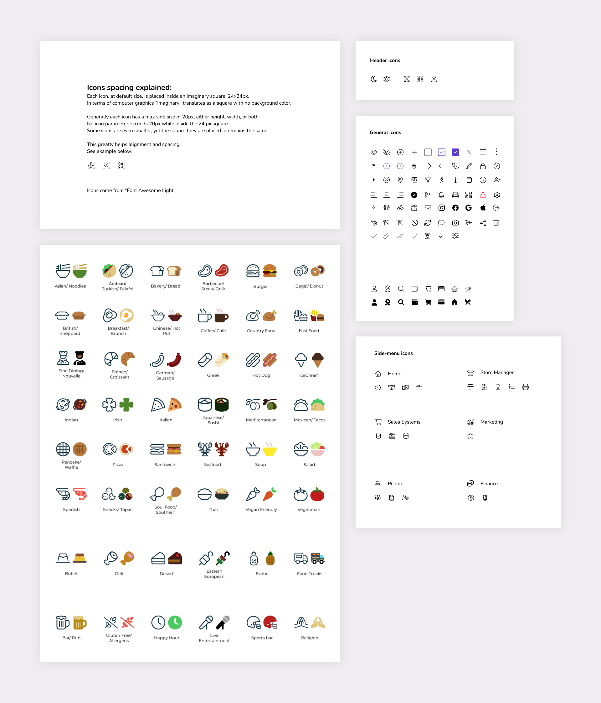
Icons & Illustrations
The icons are mainly SVG forms of Font Awesome, in "line" weight, while the food illustrations are done by myself, carefully following the mood set by the line icon set. I really enjoyed working on these illustrations, it's my favorite part of the system.
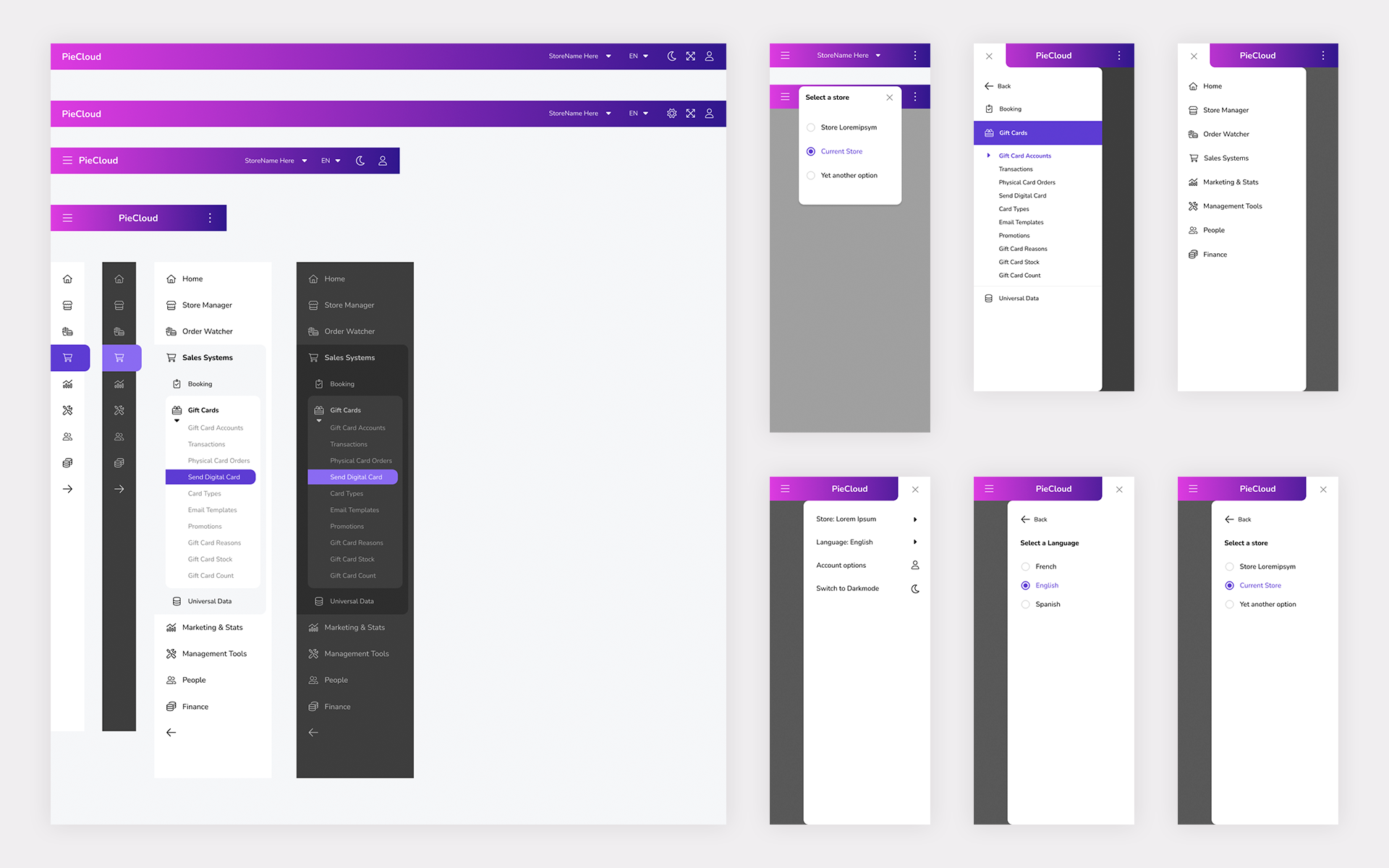
Large interface items
Interface items such as headers and menus need to be tackled separately, to achieve best results.
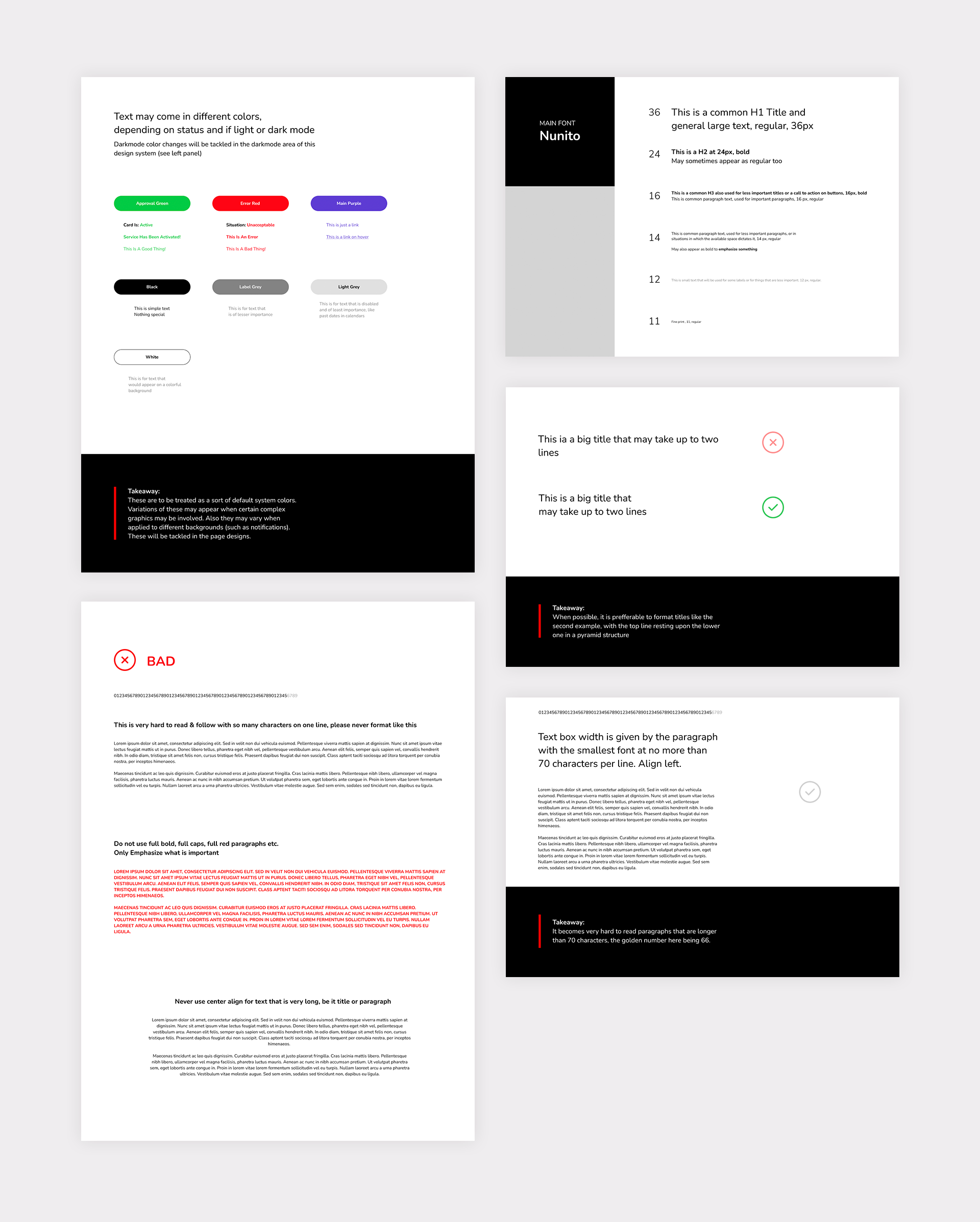
The text components and their rules